
Home
This is Bagus Martial Arts
They came to me with a vision of a brand that stood out against their competitors and made them feared inside the ring and sought after out of the ring. They're problem was that they had no idea where to start and making their branding themselves was proving difficult. This is when they contacted me.
The Problem
The brand had already attempted to create their branding themselves but it wasn't quite giving off the feeling how they wanted their brand to feel.
Problem Solved
I created a strong, abstract, tribal logo to represent the tribal feeling of being connected and apart of the club. This already adds a sense of community to the gym. The bold font with no spacing between the letters represent the boldness of the members and their lack of fear about getting up close and personal.

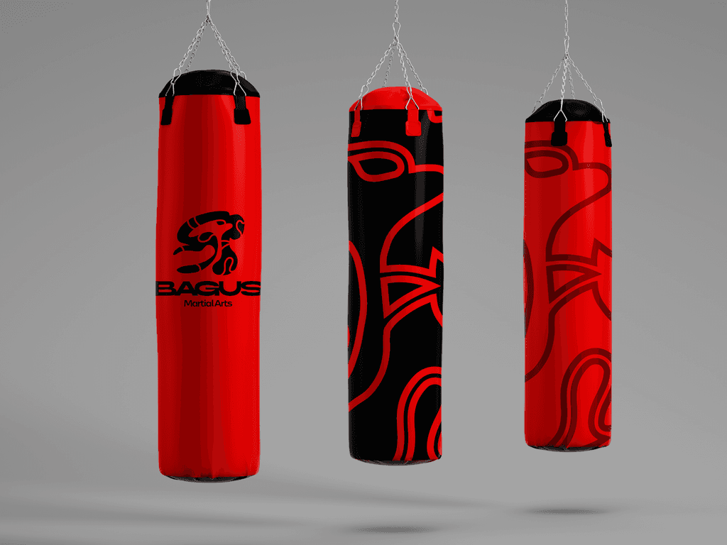
Brand In Action
I also created the gym some mock ups of what their brand could look like in real life. This is an important part of my process as I like to go a little bit further and show the client what their brand will look like once put into play. The shorts and the boxing bags are a perfect example of this.
